Choosing a Backsplash From More Than One Tile
Compare a group of samples with your counter, cookware, and evening light before deciding what should go on the kitchen wall.
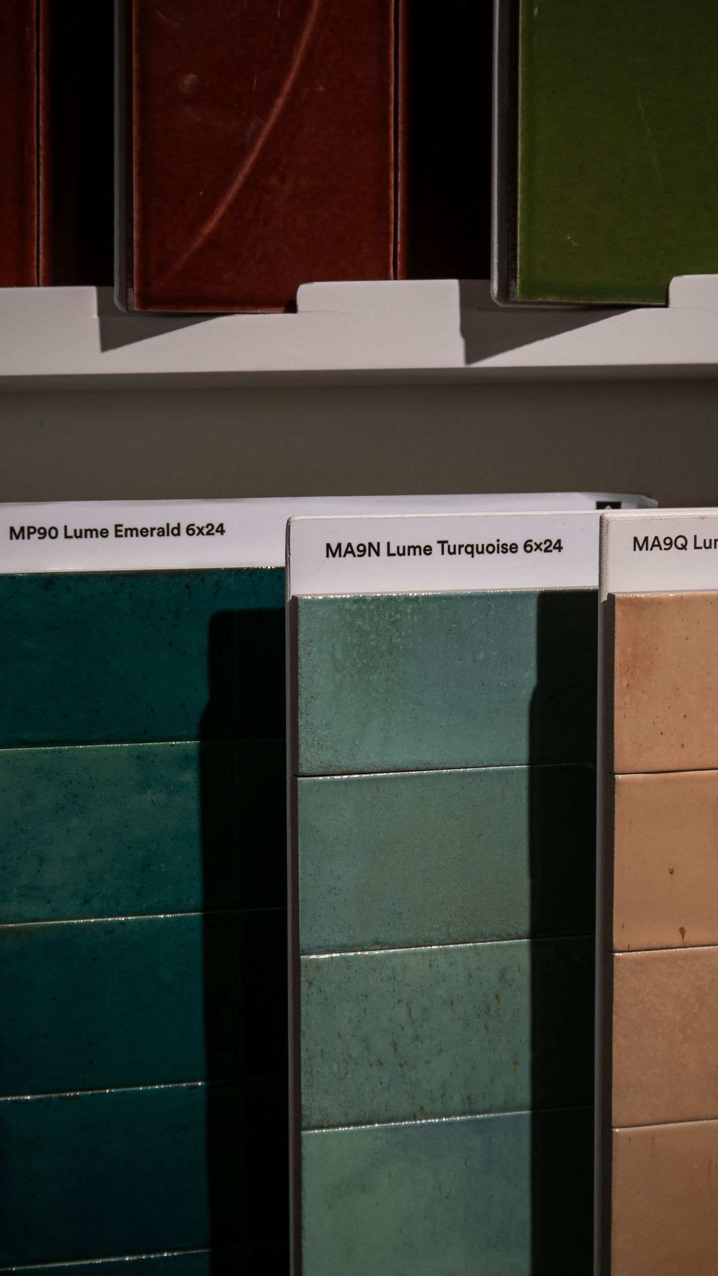
A single sample of tile behaves like a small object. In your hand it has a particular color, a smooth or irregular edge, and a pleasing weight. On a wall it becomes part of a much larger surface with repeated lines and more places for light to catch. If there are variations within a batch, the mixture is visible as soon as several pieces sit next to one another. The finish that appealed to you as a small rectangle might be beautiful across a wall. You need to give it a chance to show you what happens between those two scales.
Start by naming the stretch of wall you actually intend to change. A slim band beside a sink has different proportions from a long surface that rises all the way to a ceiling. Consider which parts you see while cooking and which parts you see from another room. A splashback behind a range can appear much larger from a nearby seat than it does from a place directly in front of it. Take a few photos and make a drawing to scale before you decide how much visual movement the wall can carry.
Look at a field of tiles at the right angle
Ask for several pieces of the same tile or see if the supplier offers a sample board. Put the tiles next to one another with approximately the proposed gaps and look at them vertically. Light strikes the kitchen wall differently from the way it strikes a sample laid on the counter. A glossy surface may look calm on a flat table and give you a row of bright reflections when it stands against the wall. Compare it from the doorway and from the position where you prepare food. If there is lighting under a cabinet, switch it on and look along the surface as well as straight at it.
Compare how much the pieces vary before choosing a finish. A tile with an irregular glaze might look nearly solid when the pieces come from one end of a sample board. Place the lightest and darkest samples beside one another to see the range. If the maker describes the amount of variation, ask what that means for a whole order and whether samples represent the material now in stock. Individually lively tiles often look balanced when mixed across a large area. In a small patch behind a sink, one especially dark tile can draw attention every time you use the tap.
Try the counter color against the tile in both natural and artificial light. Where the surface has a prominent streak or aggregate, compare the tile with the middle of the counter as well as its quietest spot. Consider a pale tile beside a white counter. Two surfaces that both looked white in a shop can make one appear peach and the other blue when they are adjacent at home. That difference can be appealing if it is clearly visible and belongs with other materials nearby. A larger sample gives you a better chance of judging it.
Give the joints the same attention as the surface
Use slips of paper or strips of card in the color you are considering for the joints. Leave enough space to approximate the joint width that is appropriate for the product. Ask the supplier or installer to confirm that width. Some handmade or irregular tiles need more allowance than precisely cut pieces. As you move away from the board, watch the moment when the joints become as conspicuous as the tiles. In a layout with dark joints around a pale tile, the line pattern may be the most prominent element on the wall.
Consider a joint color that relates to one of the other surfaces in the room. A tan taken from the counter may warm a pale tile and make the grid softer. A dark color might pick up a detail from the cabinet pulls and give the wall more definition. Try each variation behind the objects that normally sit nearby. A rail of utensils and a grid of strong lines can look busy together. The same grid behind a mostly clear work surface might feel pleasantly structured.
Check what maintenance is recommended for the actual tile and joint material. Care can differ even among tiles that look similar. Some surfaces need particular products or more care around spills. Ask how the finished materials should be cleaned and what to do if a joint becomes discolored. Look closely at textured samples and think about the cloth you usually use after cooking. A prominent ridge may catch a cloth where a smooth surface wipes easily. On a low wall near the worktop, those small differences come up more often than they would on a wall that gets little use.
Decide where the pattern begins and ends
Mark on paper where the wall stops at a cabinet, door casing, or open end of the counter. Mark the center of the most visible appliance or fitting too. Ask the installer to discuss where full tiles and cuts would fall. A narrow piece at one end of the wall is easy to miss on a small rendering. A tiny strip repeated all the way up one side can be conspicuous once the wall is finished. Adjustments in the starting point can change both ends of the run, so look at the whole wall before focusing on one desirable alignment.
Evaluate height where the wall rises above a window or steps down beneath a cabinet. A straight line can make the transition clear. A pattern that intentionally stops at a cabinet edge can leave a simple place to finish the exposed side. Consider what will be visible from a seat across the room. A joint that looks centered from a standing position can seem to run into a cabinet handle when viewed from the dining table. Photograph the paper plan straight on and compare it from two angles. The plan will be easier to discuss with an installer when you know which lines matter from the places people occupy.
For a tiled area that ends in the middle of a wall, look at the exposed side of a sample. Some pieces have a side whose color differs from the face. Ask about an appropriate finished edge for the material and the site. Compare a sample of any trim with nearby handles and appliances in the room. They do not have to be the same finish. It helps to see whether the edge calls attention to itself, especially if it will be in the first view when somebody walks in.
Let the wall work with the kitchen you use
Clear the counter for the first comparison. Then restore the objects that stay there on a normal day. Put the oil where it goes while cooking and the board where it dries. A tile with a strong pattern might look crisp in the first test and distract from the tasks of a crowded work surface in the second. An understated tile can have enough character once it sits behind items with changing shapes and colors. If an area usually remains empty, it may be a good place for a more distinct pattern.
Notice how the wall meets daylight at the sink and task lighting nearer the stove. Deeply textured pieces can cast more pronounced shadows under lights that shine close to the wall. If a shine near the worktop bothers you, check whether it moves when you change position. Ask for a real finished sample in the gloss level you prefer and test it beside the light you already have. Small changes in sheen can alter the whole appearance while keeping the color you like.
In a shared kitchen, ask the people who clean the wall to look at the finalists. A busy cook may prefer a surface they can wipe without checking each indentation. Someone else may value the way several tones hide small marks between cleanings. These are different preferences and worth making explicit. A useful choice can have a little texture in one part of the room while reserving the easiest surface to care for where the heaviest splashes occur. Check which materials the manufacturer recommends for each intended location.
Keep a record before you place the order
Put your final samples on a board with the counter, cabinet, and intended joint color represented. Label the tile code, color, finish, and sample date. If you plan to ask somebody else to review the materials, take a photo in the same kitchen rather than sending a catalog picture. A catalog image can communicate pattern. A sample in front of your cabinets shows the relationship you are choosing.
Confirm with the supplier or installer how much material the wall needs, allowing for cuts and variation as appropriate. Ask whether matching replacement pieces can be obtained later or if it makes sense to keep a small amount from the same order. Make a note of the care instructions and product identification where you keep the rest of the kitchen records. Keep those notes once the work is finished. A repair several years later is easier if you can identify the actual product rather than guessing from a photo.
The last useful comparison takes place at an ordinary time of day. Put the favored sample up while someone makes tea or gets dinner ready. See whether the surface looks agreeable behind the familiar objects and whether the planned joints still have the right amount of presence. You may find that your favorite tile is the one you were least inclined to choose on its own. Its color has a context now, and the spaces between the pieces have become part of the choice.